Capilano University
Ahead of the 2020 student enrolment season, Capilano approached Ion Brand Design to facilitate the art direction and key messaging for their upcoming campaign.
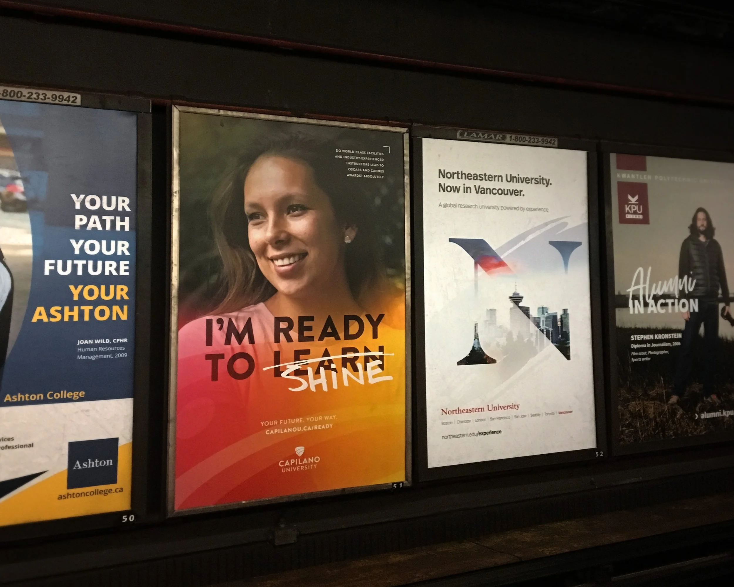
Following a collaborative workshop with our design team led by David Coates, I left the session with a few key takeaways I wanted to explore. Knowing that CapU has the benefit of stunning photography showcasing their students in a variety of experiential learning environments, my approach was to hone in on a set of stylized portraits with short and punchy headlines. These portraits were meant to show students in-situ around the campus, engaged in their environment and leaving the viewer with a sense of inspiration and excitement. Ion previously developed the award-winning identity for Cap which gave me a firm foundation to experiment with their colour palette, writing style, and key messages within this project.
The outcome was a colourful and flexible kit of parts for their internal team to execute on where we provided production templates and a folder of handwritten assets to customize the materials even further. CapU’s marketing team rolled out this campaign across Metro Vancouver via transit shelters, bus backs, skytrain stations, billboards, and various print media formats.